Tuesday 29 October 2013

Qualified Interior Design Professional


I thought I would take this opportunity to advertise my services as an Interior Designer. If you enjoy my blog you would love my designs and my flexibility allows me to adapt to your needs and your style and most importantly, your budget. 

For those of you that don't know, my name is Mila, I live in Dartford, Kent with my fiancé and my gorgeous Beagle called Dash. Since we bought our house 2 years ago I have been dedicated to designing each room to our taste and making it beautiful and I want to do the same to your rooms making them perfect for you and your tastes.

I am in the process of developing my own business, so keep checking back for a gorgeous website, flyers, business cards and, of course, photos of completed successful projects! I am so excited to be working as an Interior Designer, I love nothing more than to see a room in need of change, sitting down and working out a brand new design adhering to the brief that the client has given me. Not only do I offer design services, I also have great contacts in the labouring, painting and decorating and handyman services - I've got you covered if you love my designs and you want me to help you implement them! 


If you are looking to hire an Interior Designer I urge you to contact me, tell me what you are looking for and I am sure I will be able to assist you at a great price, not to mention a fab range of free home goodies if you decide to go ahead with my design (whether its the first design or the thirty-first - but I assure you it wont take me more than one to get it right!)


The areas I cover are:
- Kent
- Essex 
- London 
- East Sussex 
- Oxfordshire
- High Wycombe
- Middlesex
- Windsor


So if you're in one of those areas and you think you could benefit from my services, please call! (if youre around one of those areas, give me a call anyway - I am sure I can work it out!)

I look forward to hearing from my potential clients - book your first consultation now!

Bye, Dolls xo

Mila
missinterior@outlook.com
07528 061 261

Tuesday 22 October 2013

Home Office Heaven

As I am currently developing my business, I thought a topical blog post would be home offices. Two things to bear in mind are:
- you will be spending a lot of time in here (in my case, more 40+ hours per week)
- it is still a part of your home

So with these in mind, you need to think professional but comfortable, and it should always tie in with your home. It should also tie in with your profession, for example, my Interior Design business wouldn't exactly give the right impression with red walls, green patterned carpet and black furniture. If you are planning on inviting clients to your office (many decide to go to their clients rather than have clients come to their home) then you need to set the right impression with them. If your office looks untidy, unorganised and unprofessional, the chances are, your clients will think that you are too, and that that is the way you run your business. I have found some pictures of home offices that I think look good in terms of style, practicality, functionality and (most importantly) fashion!!

Have a look and let me know what you think!


This home office is a calming pastel green theme with wooden furniture. This type of desk is great because it has so much storage but it is compact. Perfect desk for the smaller room.


This is the perfect home office for a girly girl, especially if your profession is something arty and fun. It is enjoyable to work in, it's light and breezy with no dramatic or moody tones. A winner!


This home office is great for if you don't actually have an allocated room for your office. If you have unused space in your living room or space that you wouldn't mind using then a desk like this with lots of storage is the best deal.


This desk is the ideal desk. Ridiculous amounts of storage, plus plenty of surface space for any paperwork, computer and computing equipment. And what's more, it looks great!


This is such a small space, but you don't recognise that straight away because it is decorated impeccably. I love the art-deco style, the yellow, navy blue and stone grey look beautiful together. Perfect for all seasons.


Business

Instagram @_missinterior
Twitter @_missinterior

Personal
Instagram @princessbigbum
Twitter @princessbigbumx


Saturday 5 October 2013

Heavenly Hallways

Today I decided to blog about Heavenly Hallways. The hallway is important in the home because it is the entrance to the home which subconsciously sets the scene for the rest of the house. For example, if the hallway is unwelcoming and badly decorated, guests aren't likely to hold much hope for the other rooms, whereas if the hall is inviting and well designed, it often intrigues the guests and encourages them to wonder what the rest of the houses look like. 


Having a grand entrance also serves well for parties as it is somewhere that people can congregate on arrival for some pre-drinks or whilst waiting for entertainment to arrive.


I also like to think of the hallway as a gallery. As you can see, the one above looks rather Art Deco. It is a nice area to showcase paintings and pictures that people can stand and look at on entering your home. 


The hallway in most homes is the first place you go when you arrive and the last place you go when you leave, so make sure it is functional. A nice large mirror is always needed for last minute checks to hair and makeup! 


Hallways need good light. They often don't get much natural light other than through panels in the doors (if there are any) so it is important to have decent artificial light. Spotlights are good for this as they are subtle but practical, setting a nice mo

Stair lights are a good way to light up the hallway. For health and safety purposes there should always be an adequate lighting supply, however when it is night and only subtle light is needed, stair lights are a great idea.


Minimalistic hallways are always nice, it is best not to clutter them with paintings, photographs and statues, it can make guests assume that the rest of your house will be cluttered. 


Friday 4 October 2013

Making Smaller Bathrooms Work


The layout of this bathroom is pretty standard. There is no wasted space yet it is not cramped. Generally people don't do makeup and hair in the bathroom anymore, these are now usually done in the bedroom or dressing room, so the common activities for the bathroom (brushing teeth, bathing, showering, using the toilet, washing etc.) all have plenty of room.

                   
This bathroom is beautifully designed considering its unconventional shape. Having a curved shower against a corner is a huge space saver. With all of the pieces in corners it opens up more space in the middle of the room for drying off from the shower and getting changed.

                   
Installing  a vanity unit not only saves space, it also creates storage and also it hides any ugy plumbing tubes or pipes. The storage is a big factor, because it allows any bathroom amenities to be stored away out of sight rather than cluttering the corners of the bath and sink. 

                    
I love this bathroom style, the monochrome colour scheme makes it look so modern and stylish. Also, as there is no window, you would think that having dark colours would make it dingy but the white suite brightens it hugely.

                    
The layout of this bathroom is, too, quite standard. Again there is ample room for the usual bathroom activities. The bath is a huge space saver as rather than having a single bath and a shower, they are together along one edge which is opening the space in the middle again. 

Thursday 3 October 2013

Showhome Style

Today I have been doing some research on showhomes and collecting some images that I thought I would post in my blog. I usually spend a lot of my time looking at real estate online, and as is obvious if you have read any of my blog posts, I love newbuilds. I jus think that there is nothing better than getting a completely blank canvas to make your own. Of course, for those who don't enjoy  Interior Design as much as we do, it is so much more desirable to just move in.

I've found some pictures to try and convince those people that there is so much to do with blank canvases, you just have to use your imagination...

I love this area. I am a huge fan of open plan so this really ticks a lot of boxes for me. Not only is it convenient for social occasions such as house parties and hosting dinners, but it is good from an architectural and design point of view also. It allows natural light to flood through the house, in this case from front to back. It is also efficient as it allows natural light to replace the need for artificial light as much as possible which will save costs.

This kitchen/diner is so light and breezy. It is such a calming and relaxing environment, the baby blue highlights the calmness which has to have a positive effect on the hectic mornings full of breakfast, making lunches and trying to get the kids ready for school!  It also makes it an enjoyable place to sit in, I would find myself socialising in there and also doing work in there and reading magazines etc.

This kitchen is designed to be more stylish than calming and relaxing, however using cream rather than white for the units makes it more calming than white units would. It is still a beautiful kitchen and also somewhere that I would find myself spending more time. Although not as big it has all the functionalities a kitchen needs. The spotlights also give a soft, luxurious feel which is especially nice when cooking at night.

To me this is the kitchen/diner that screams "SHOWHOME" the loudest. ,any people don't like this effect as they feel they can't mess it up and it looks a little too clinical, however i absolutely LOVE it! It is so stunning and perfect that I just feel like I would love to cook in there, it would be a pleasure. I think if you don't have a nice kitchen, you aren't going to enjoy cooking as much, just like if you have a gorgeous brand new car, you enjoy driving a lot more than if you have an old rubbish car!

I love how this is conveniently open plan. It has the potential to welcome privacy through the French doors, however when they are open it creates almost one large room which is extremely social and party-friendly. The decor is beautiful and is a huge inspiration to anyone who has a blank canvas.

The under-counter lighting creates a beautiful, soft touch which is a great effect in a kitchen. It softens the sharp edges and the clinical lines of the kitchen and blends the counters with the floor almost making it seem like it is floating. The natural light in this room is also great which makes it a nice place to eat breakfast in the mornings. 

The decor of this room is spot on. It looks so rich and modern,  but it also has the comfortable element  in that it is carpeted with a rug which helps insulate the heat in the room, and the room is not too big and spacious, it can still be comfortable and cosy.

This bedroom is absolutely stunning. It is so stylish and classy and you can tell a lot of thought, time and most likely money has gone into the design. The four-poster bed alone is luxurious enough, but if you look around, everything from the carpet to the curtains, the furniture to the artwork on the wall is high-end, top quality standard.


Wednesday 18 September 2013

Wallpaper Wednesday!

Today's blog is dedicated to the beautiful thing that is WALLPAPER!

I LOVE wallpaper, I think it looks classy and stylish and it creates a glamorous, high-class atmosphere in a room. Sure you can accessorise walls with beautiful coloured paint and some amazing wall art, but I don't think there is anything like wallpaper. You can get wallpaper to go with anything, any colour and any style/theme and that is one of the many things I love about it! I have found some pictures online which I hope will help you understand why I love wallpaper sooooooo much.

This living room fascinates me! It is such a mismatch of colours, but it soooo works! There is an array of colours here, purples, greens, yellows, creams... Who would have thought that they could all go so nicely together? This is certainly a far cry from the strict monochromatic colour schemes I love, but I think this looks excellent! And as I said before, the wallpaper sets the scene, it looks so stylish and I am not sure the room would work so well without it. Plain cream walls would look good, but there is just something about a feature wall that makes a room work and this is proof of that!
.


This one is more my thing. Dark colours, especially blacks and greys, are a favourite of mine. Having a decent sized living room with large windows allows me to use these colours, but they don't alway work. Here, however, they work well. The green furniture adds some flavour to the otherwise dark and plain room, and it complements the wallpaper very well! I really like the contrasting colours used as I think it is good to use more than one colour (or hues of more than one colour) in one room, here it works perfectly!


.


This room reminds me of an art gallery! I love the minimalistic approach - I can't stand clutter! The colours go perfectly. I always find that one of the best colours to complement black with is red, I love that match. I love the sort of Art Deco feel, it is ultra-modern, light and airy and just looks fresh and comfortable at the same time. Showhome type rooms tend to be quite clinical and rather uncomfortable as image is prioritised over comfort, however this looks like a room that could be cosy on a cold winters evening. It has all the functions (or room for them) that a living room needs, somewhere to sit, somewhere to put your drink and plenty of space for a television and storage facilities. So much love for this room and its design!


.


I can't quite get my head around this design. I see what they are trying to do, but I am not sure about sandwiching floral wallpaper between stripy wallpaper, not to mention the contrast between the horizontal and vertical stripes. There is something that I like about it but I can't quite put my finger on it. I thought I should put a picture of wallpaper I wasn't sure of so as not to come across biased! I would be interested to know what you guys think of it? Is it just me who finds it a little odd?


.


In this room all of the walls are covered in wallpaper, but there is still a feature wall. The feature wall is the one with the patterned wallpaper. The others are covered in plain wallpaper which is still effective. I prefer it to paint as it seems more warm and inviting than paint which can create the effect of a cold wall. Wallpapered walls are rarely cold, and they tend to look more plush. I love the neutral colour scheme of this room, it is classy and elegant, but at the same time something you could get cosy in. 


.


This is one of my favourites. The elegant wallpaper looks rich and is just stunning. It goes perfectly with the rest of the room the furniture and accessories etc. It is typical show home style and that I love. It looks silky and warm which is so inviting and the colour is gorgeous. It is a classic feature wall and it works perfectly.

Tuesday 17 September 2013

Taupe Tuesday!

Taupe - grey with a hint of brown


This post is dedicated to the neutral but classic colour scheme - taupe. I love this, because it is natural, goes with almost everything and still looks stylish and beautiful! I have found some pictures which highlight my love for taupe.


This room looks so grand and classic, yet it has an element of tradition to it. I think it is the flooring, because the wooden floor adds to the traditional look. I just love how well fresh white goes with taupe. I am usually a monochromatic person only using hues of one colour, nut I quite like this contrast and I think it goes really well!


This room is stunning, and the taupe is highlighted in the furniture and the flooring this time rather than the walls. The neutral, subtle colours are calming and serene therefore perfect for cosy, relaxing rooms such as living rooms, bedrooms and bathrooms. This living room also looks classic however it is still ultra-modern and stylish which I love.


I love the decor in this room, and the access are beautiful. I love oversized pieces so the clock-style mirror was a huge win for me. Again the taupe has been mainly highlighted in the furniture rather than the wall coverings which works really well. I love the contrasting wooden table, again, coming away from the monochrome.

It isn't just the decor I love here, I love the idea! It is such a good way to save space and to organise your things without having to have them shut away. I like to have my functional objects out away, but when they are easy on the eye and actually quite stylish, why not have them in display? Stylish and practical!


Monday 16 September 2013

Monochrome Monday!


Monochrome - Consisting of varying tones of just one colour


Many people mistakenly think that the term Monochrome means black and white - to a certain degree they are correct, however it is not as narrow as that. Monochrome means that the colour scheme consists only of colours from one section of the colour wheel - to put it simply, a room consisting only of lots of shades of blue would be monochrome. Whether there are two blues or 12 blues, the room would be monochrome. Black and white, however, is probably the most popular monochrome colour scheme. As we all know, I am a sucker for modern homes, and you can't get much more modern than blacks, whites and greys. My living room is kitted out in these colours and I love it! Not only is it a modern colour scheme, it is stylish and professional. In this blog I am going to look at monochrome colour schemes in the home and what you can do to make them stand out. 


*


This living room is stunning. The colour scheme is hues of black, which range from black right through to white including greys and silvers. This is a classic, simple design yet looks so clean and modern. The decoration is stunning and there are lots of straight lines and symmetry which I love.

Something else that goes well with this colour scheme, which can't really be identified in the colour wheel, is glass. It goes with everything, but I specifically like it in rooms with a colour scheme including black as it prevent them from looking too dark reflecting light from windows and doors and distributing it around the room.


*


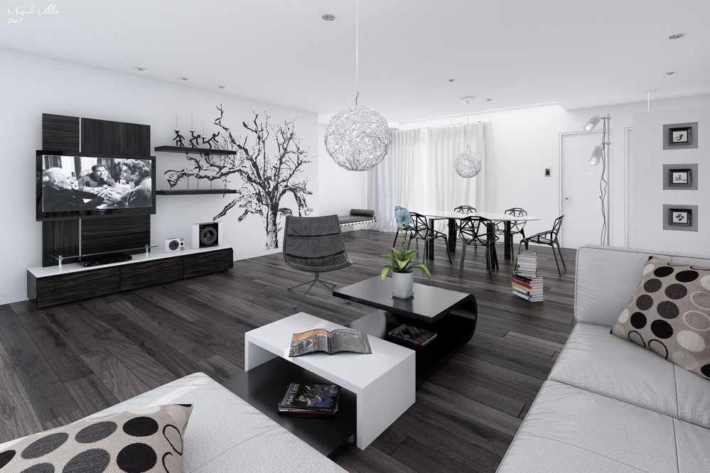
This room is of similar hues, however it is more black and white than anything else, which looks great. I love the high gloss coffee table which, again, reflects the light coming through the windows around the room, preventing the blacks to darken the room too much - like a glass table would. Also, mirrors are good to create this effect. 

The dark floor also creates this modern look that I love, it looks clean and professional and also doesn't show dirt as well as lighter carpets, so it is also more practical for those with pets or children. The grey chair creates an accent for the room.


*


This bedroom is absolutely beautiful  - it looks so comfortable and luxurious. Your bedrooms should be a temple, and this is certainly that! Again, the monochromatic scheme here is hues of black through greys and a small hint of white. The lighting adds to that luxurious feel, and the subtle vertical striped wallpaper is also a fabulous accent (not sure that it can outdo the lighting however!).

This just looks like a bedroom that would be a pleasure to snuggle into on a cold winter's night. Isn't that what everyone wants in a boudoir?


*


This room creates the same effect, using the same or similar lighting accessories. The thing I love most about this room is the grey slate laminate wood flooring. It is a stylish and modern take on the traditional beech laminate wood flooring, it ties in with the colour scheme and it looks stunning. with the black and white accessories and furniture, it goes beautifully.


*


The next three rooms show what happens when you use a monochrome colour scheme but you throw in a splash of a completely different colour. This works so well and here are some examples that show this!


This room uses a monochrome colour scheme, however as a partition (as the room is open plan, the dining area and kitchen are around the corner) a beautiful purple floral wallpaper has been used to distinguish the two different areas, however the colour is flowing through with the purple flowers on the table. This works so well because it isn't contrasting, it doesn't clash, it works well and it still looks beautiful and very modern. it ensures that there isn't too much of one colour scheme, two rooms have different colour schemes but they are linked together without clashing.


*


Here is another example of using purple to break up the monochromatic colour scheme of black and white. Although small and simple, the flowers in the middle of the dining table create the beautiful illusion of a virtual splash of colour, and breaks up the black and white.

One thing I love about this room is the interesting lighting choice, I love how they aren't all the same shape, it adds flavour to the room.


*


This room is beautiul. I am in love with the lemon yellow colour that has been chosen as an accent colour, and rather than just having a couple of references to it, it is highlighted in most of the rooms features from the photos on the wall to the wallpaper to the lemons on the coffee table and the flower on the side.

I love it when an accent draws many aspects of the room together, and that is certainly what the yellow is doing in this room, and it works really well. I love this room and its design, I think it looks excellent!


*


I thought I would show you all a few pictures of my own living room. It is still a work in progress, I am still looking to source some good quality grey slate laminate wood flooring, and some work still needs to be done on the furniture arrangements, but I am so happy with how it is turning out. See my take on monochrome below!