Wednesday 18 September 2013

Wallpaper Wednesday!

Today's blog is dedicated to the beautiful thing that is WALLPAPER!

I LOVE wallpaper, I think it looks classy and stylish and it creates a glamorous, high-class atmosphere in a room. Sure you can accessorise walls with beautiful coloured paint and some amazing wall art, but I don't think there is anything like wallpaper. You can get wallpaper to go with anything, any colour and any style/theme and that is one of the many things I love about it! I have found some pictures online which I hope will help you understand why I love wallpaper sooooooo much.

This living room fascinates me! It is such a mismatch of colours, but it soooo works! There is an array of colours here, purples, greens, yellows, creams... Who would have thought that they could all go so nicely together? This is certainly a far cry from the strict monochromatic colour schemes I love, but I think this looks excellent! And as I said before, the wallpaper sets the scene, it looks so stylish and I am not sure the room would work so well without it. Plain cream walls would look good, but there is just something about a feature wall that makes a room work and this is proof of that!
.


This one is more my thing. Dark colours, especially blacks and greys, are a favourite of mine. Having a decent sized living room with large windows allows me to use these colours, but they don't alway work. Here, however, they work well. The green furniture adds some flavour to the otherwise dark and plain room, and it complements the wallpaper very well! I really like the contrasting colours used as I think it is good to use more than one colour (or hues of more than one colour) in one room, here it works perfectly!


.


This room reminds me of an art gallery! I love the minimalistic approach - I can't stand clutter! The colours go perfectly. I always find that one of the best colours to complement black with is red, I love that match. I love the sort of Art Deco feel, it is ultra-modern, light and airy and just looks fresh and comfortable at the same time. Showhome type rooms tend to be quite clinical and rather uncomfortable as image is prioritised over comfort, however this looks like a room that could be cosy on a cold winters evening. It has all the functions (or room for them) that a living room needs, somewhere to sit, somewhere to put your drink and plenty of space for a television and storage facilities. So much love for this room and its design!


.


I can't quite get my head around this design. I see what they are trying to do, but I am not sure about sandwiching floral wallpaper between stripy wallpaper, not to mention the contrast between the horizontal and vertical stripes. There is something that I like about it but I can't quite put my finger on it. I thought I should put a picture of wallpaper I wasn't sure of so as not to come across biased! I would be interested to know what you guys think of it? Is it just me who finds it a little odd?


.


In this room all of the walls are covered in wallpaper, but there is still a feature wall. The feature wall is the one with the patterned wallpaper. The others are covered in plain wallpaper which is still effective. I prefer it to paint as it seems more warm and inviting than paint which can create the effect of a cold wall. Wallpapered walls are rarely cold, and they tend to look more plush. I love the neutral colour scheme of this room, it is classy and elegant, but at the same time something you could get cosy in. 


.


This is one of my favourites. The elegant wallpaper looks rich and is just stunning. It goes perfectly with the rest of the room the furniture and accessories etc. It is typical show home style and that I love. It looks silky and warm which is so inviting and the colour is gorgeous. It is a classic feature wall and it works perfectly.

Tuesday 17 September 2013

Taupe Tuesday!

Taupe - grey with a hint of brown


This post is dedicated to the neutral but classic colour scheme - taupe. I love this, because it is natural, goes with almost everything and still looks stylish and beautiful! I have found some pictures which highlight my love for taupe.


This room looks so grand and classic, yet it has an element of tradition to it. I think it is the flooring, because the wooden floor adds to the traditional look. I just love how well fresh white goes with taupe. I am usually a monochromatic person only using hues of one colour, nut I quite like this contrast and I think it goes really well!


This room is stunning, and the taupe is highlighted in the furniture and the flooring this time rather than the walls. The neutral, subtle colours are calming and serene therefore perfect for cosy, relaxing rooms such as living rooms, bedrooms and bathrooms. This living room also looks classic however it is still ultra-modern and stylish which I love.


I love the decor in this room, and the access are beautiful. I love oversized pieces so the clock-style mirror was a huge win for me. Again the taupe has been mainly highlighted in the furniture rather than the wall coverings which works really well. I love the contrasting wooden table, again, coming away from the monochrome.

It isn't just the decor I love here, I love the idea! It is such a good way to save space and to organise your things without having to have them shut away. I like to have my functional objects out away, but when they are easy on the eye and actually quite stylish, why not have them in display? Stylish and practical!


Monday 16 September 2013

Monochrome Monday!


Monochrome - Consisting of varying tones of just one colour


Many people mistakenly think that the term Monochrome means black and white - to a certain degree they are correct, however it is not as narrow as that. Monochrome means that the colour scheme consists only of colours from one section of the colour wheel - to put it simply, a room consisting only of lots of shades of blue would be monochrome. Whether there are two blues or 12 blues, the room would be monochrome. Black and white, however, is probably the most popular monochrome colour scheme. As we all know, I am a sucker for modern homes, and you can't get much more modern than blacks, whites and greys. My living room is kitted out in these colours and I love it! Not only is it a modern colour scheme, it is stylish and professional. In this blog I am going to look at monochrome colour schemes in the home and what you can do to make them stand out. 


*


This living room is stunning. The colour scheme is hues of black, which range from black right through to white including greys and silvers. This is a classic, simple design yet looks so clean and modern. The decoration is stunning and there are lots of straight lines and symmetry which I love.

Something else that goes well with this colour scheme, which can't really be identified in the colour wheel, is glass. It goes with everything, but I specifically like it in rooms with a colour scheme including black as it prevent them from looking too dark reflecting light from windows and doors and distributing it around the room.


*


This room is of similar hues, however it is more black and white than anything else, which looks great. I love the high gloss coffee table which, again, reflects the light coming through the windows around the room, preventing the blacks to darken the room too much - like a glass table would. Also, mirrors are good to create this effect. 

The dark floor also creates this modern look that I love, it looks clean and professional and also doesn't show dirt as well as lighter carpets, so it is also more practical for those with pets or children. The grey chair creates an accent for the room.


*


This bedroom is absolutely beautiful  - it looks so comfortable and luxurious. Your bedrooms should be a temple, and this is certainly that! Again, the monochromatic scheme here is hues of black through greys and a small hint of white. The lighting adds to that luxurious feel, and the subtle vertical striped wallpaper is also a fabulous accent (not sure that it can outdo the lighting however!).

This just looks like a bedroom that would be a pleasure to snuggle into on a cold winter's night. Isn't that what everyone wants in a boudoir?


*


This room creates the same effect, using the same or similar lighting accessories. The thing I love most about this room is the grey slate laminate wood flooring. It is a stylish and modern take on the traditional beech laminate wood flooring, it ties in with the colour scheme and it looks stunning. with the black and white accessories and furniture, it goes beautifully.


*


The next three rooms show what happens when you use a monochrome colour scheme but you throw in a splash of a completely different colour. This works so well and here are some examples that show this!


This room uses a monochrome colour scheme, however as a partition (as the room is open plan, the dining area and kitchen are around the corner) a beautiful purple floral wallpaper has been used to distinguish the two different areas, however the colour is flowing through with the purple flowers on the table. This works so well because it isn't contrasting, it doesn't clash, it works well and it still looks beautiful and very modern. it ensures that there isn't too much of one colour scheme, two rooms have different colour schemes but they are linked together without clashing.


*


Here is another example of using purple to break up the monochromatic colour scheme of black and white. Although small and simple, the flowers in the middle of the dining table create the beautiful illusion of a virtual splash of colour, and breaks up the black and white.

One thing I love about this room is the interesting lighting choice, I love how they aren't all the same shape, it adds flavour to the room.


*


This room is beautiul. I am in love with the lemon yellow colour that has been chosen as an accent colour, and rather than just having a couple of references to it, it is highlighted in most of the rooms features from the photos on the wall to the wallpaper to the lemons on the coffee table and the flower on the side.

I love it when an accent draws many aspects of the room together, and that is certainly what the yellow is doing in this room, and it works really well. I love this room and its design, I think it looks excellent!


*


I thought I would show you all a few pictures of my own living room. It is still a work in progress, I am still looking to source some good quality grey slate laminate wood flooring, and some work still needs to be done on the furniture arrangements, but I am so happy with how it is turning out. See my take on monochrome below!


Monday 9 September 2013

Don't Be Scared of Studio!

For as long as I can remember, the thought of a Studio Apartment  - that's one room for all rooms (the bathroom is occasionally private!) has made me a little uncomfortable. I have never been a fan of small spaces, I like open plan, but it has to be large to compensate for the lack of division for the different activities that are carried out in each room. However, after some extensive research and polling I found that actually, studio apartments can work! All they need, is a personal touch. Maybe the touch of an interior designer! Check out the pictures below and see what you think of what I found during my research.

This is an image of a Studio Apartment in a complex of recently built luxury apartments called Beaufort Park in North West London. My fiancée and I had an apartment here, we lived in it for over a year, although we had a 2 bedroom, a lot larger than the Studios. Looking at the studio apartments, because they are so nicely done it almost takes away from the lack of space. The design is stunning in the show homes, and the blank canvas that you get if you purchase one of these apartments allows you to make of it what you wish. The amount of natural light helps light the room so much that it appears larger; throw in a couple of mirrors and a light, neutral colour theme and you can virtually add a good few square feet to the room. What you have to remember is that once your guests have left for the night, the room is yours again, and only yours (and whoever you choose as company) so that is when you can turn it from a living room into a bedroom, and it doesn't have to disrupt anyone elses living room activities. (What else changes other than a sofa into a bed? Not a huge change anyway!) Studio  apartments are designed for one, at a push two people, so there is no need to worry about the traffic flow in the room. it would be kept to a minimum as it is one space with few if any obstacles, and 1-2  people. If you look at this floorplan of a Studio Apartment (Apartment 1244) it shows the space used for dining, living, kitchen and bedroom. The bed is cleverly and stylishly hidden away, masqueraded as storage in beautiful white high gloss - it folds down to a double bed which fits beautifully in the space. there is still an element of a hallway, storage for laundry, kitchen space and furthermore the balcony adds extra seating space and is perfect for social events such as house parties and dinners. It is still within speaking distance but it is able to be closed off for smoking or privacy. It has everything you need to live, it is just more confined and compact than your regular house/apartment. I think that these types of apartments are perfect for students or young couples getting started on the property ladder. They are in high demand because not only are they cheap to buy, they are cheap to run. Think of how cheap the electricity will be, only having to light and heat one room rather than several. This is just one of the many benefits to having a studio apartment.


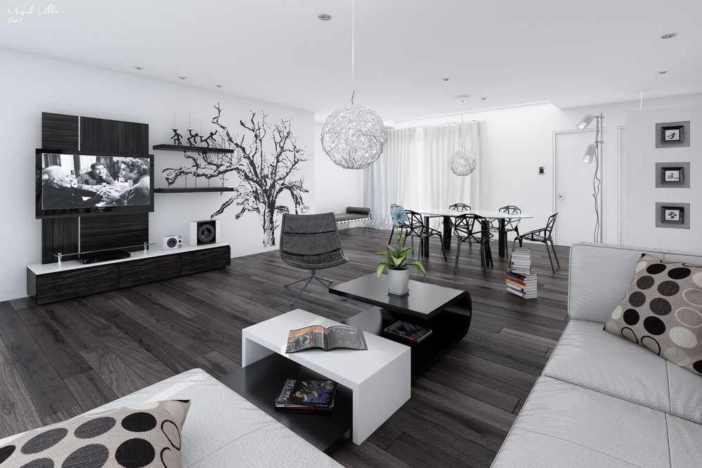
I love this Studio Apartment for many reasons. One is that it still has its defined sections despite being one big room. The kitchen is kept to one side of the room and is sectioned off with the bedroom being on the other side of the beam, set a little further back than the kitchen giving a bit of privacy to the bedroom area. The living area is in front of these two areas, in the middle of the room with the sofas acting as dividers to separate the kitchen and bedroom. I really like how this is set out because it provides strict sections for each area of the room but it is sociable for parties and dinners, and it is also functional because everything has its place and is exactly where you need it. The decorating is also very stylish, dark, which I usually wouldn't suggest for smaller spaces, but it works with the bright highlights such as the high gloss white kitchen, the accents such as cushions and bedding, and the mirror. It is very modern which I love.

I am absolutely in love with this studio apartment. in this case the bed folds out from the corner sofa - bar the bathroom, this is the only space in the apartment, with some storage along the wall of the camera's point of view. I love the decoration, it reminds me of an art gallery scene, it is very art déco  but very very modern and crisp - white everythere with hints of charcoal. The space is organised beautifully and logically - if you look carefully you can see the sink alongside the dining table. Everything is there it is just very compact, but I am coming round to this idea, although I could never see myself being comfortable in such a small space.

Studio Apartments Polls
I created a poll to see who was for and who was against studios. I was surprised by the result as I did it before I did my own research on studios and realised that they actually weren't a bad idea - the result now doesn't seem so shocking to me!

I asked: Do you think that Studio Apartments are a great way of compacting all living amenities?

The results were: YES - 74%          NO - 26%

I was shocked before doing my research - it just goes to show, you shouldn't judge a situation you know little about! I have learnt a lot and I must say my opinion has been changed. If you feel the same way I did and this hasn't changed your opinion, I suggest you have a look round some show homes which have Studio Apartments to view, this way you can see them in the flesh and their practicalities. That is what I did which helped me to understand how they are very functional!


Business
Instagram @_missinterior
Twitter @_missinterior

Personal
Instagram @princessbigbum
Twitter @princessbigbumx


Thanks, dolls!

xo